Confirming sample color and pattern for custom pickleball paddles is where many orders go wrong. I have watched buyers approve a screen mockup, then panic when the real paddle arrives looking dull, shifted, or off-brand. At our Dongguan factory, we lost a week once because a client skipped one simple comparison step. That mistake taught us a workflow that now protects every order we run.
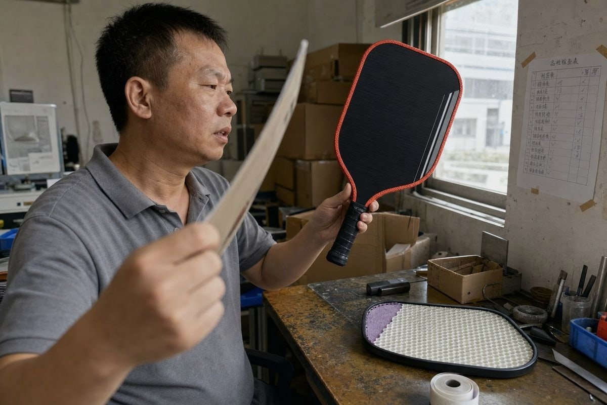
To confirm sample color and pattern match your design for custom pickleball paddles, request the finalized design file before printing, have the factory print one physical sample, then compare the sample against the design side by side. If the difference is minimal, the paddle matches your design and production can start.
That is the short answer. Now let me walk you through each step in detail, so you know exactly what to ask for and what to check before you say yes to mass production.
How can I make sure the sample color matches my brand's exact Pantone code?
A client in the Philippines once sent me a HEX code over WhatsApp and asked why her printed paddle looked slightly warmer than her website banner. That conversation is why we now insist on Pantone references for every branded order.
To match your brand's exact Pantone code, give the factory the PMS number directly instead of HEX or RGB values, ask them to print a color proof on the actual paddle face material, and compare the proof against a physical Pantone swatch under consistent lighting before approving.
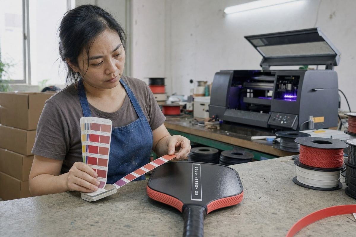
Screens lie about color. Your monitor shows RGB light, but a paddle face is printed with physical pigment 1, usually in the CMYK color space. Bright neons and highly saturated tones are the hardest to reproduce, so the gap between screen and print can be big. The Pantone Matching System solves this because a PMS number means the same ink formula anywhere in the world, on any production batch.
Why the substrate changes the color
Here is something most buyers never think about. The same ink looks different on different surface material texture. In our workshop, we run UV printing technology 2 on both fiberglass and carbon fiber faces, and the results are not identical. Fiberglass reflects more light, so colors look more saturated. Raw carbon fiber 3 is dark and light-absorbing, so we print a white underbase first. If that underbase is too thin, the black substrate bleeds through and mutes your top-layer colors.
| Color reference | Reliability for print | Why |
|---|---|---|
| Pantone (PMS) code | High | Standardized ink formula, batch-to-batch consistency |
| CMYK values | Medium | Print-native, but varies by printer calibration |
| HEX / RGB | Low | Screen-based light values, not pigment values |
Practical steps to lock the color
First, send your PMS codes 4 in writing, not as a screenshot. Second, ask whether the paddle face is matte or glossy finish, because a matte coating 5 softens color while gloss deepens it. Third, request a photo of the printed proof next to a Pantone swatch book in daylight. Finally, remember that color calibration on the factory's printer matters more than your monitor settings. We recalibrate ours regularly, and we tell clients when a specific neon simply cannot be hit in CMYK, so they can adjust before production instead of after.
What steps can I take to verify the pattern placement is accurate before mass production?
Pattern placement is a trade-off I weigh on every job: push the artwork to the very edge for a bold look, and you risk the edge guard covering part of it; pull it inward, and the design can feel small. Getting this right starts long before printing.
Verify pattern placement by requesting the finalized layout file on the factory's paddle template before printing, checking bleed, safe area, centering, and orientation, then confirming those same points on a printed sample photographed straight-on next to the approved design.
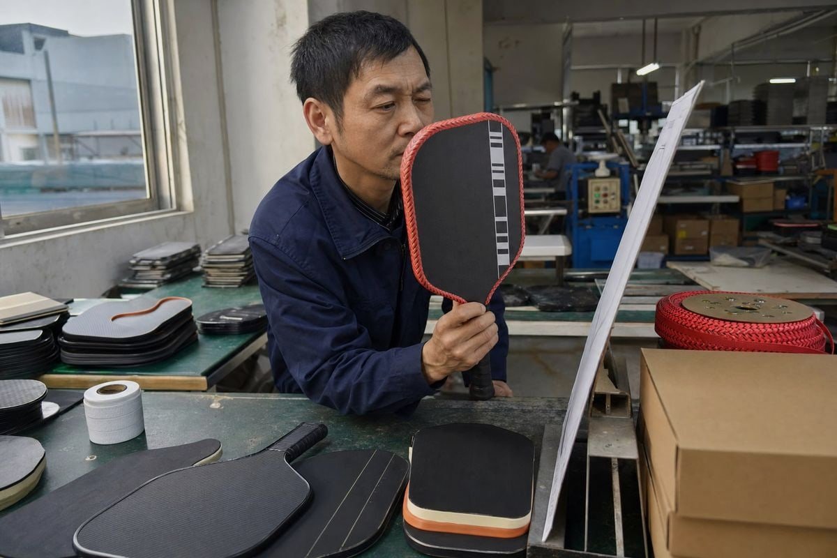
This follows the exact workflow I use with my own clients. First, the supplier must organize the finished design file and send it to you before anything gets printed. Second, the factory prints one sample and compares it against that design. Third, if the difference is small, the sample matches your design and you can move forward. Skipping the first step is the most common cause of misaligned patterns, because the buyer never saw how the artwork sat on the real template.
Use the graphic alignment template properly
Every paddle shape has its own template. Our catalog alone runs six face shapes, from elongated to widebody, and the same artwork sits differently on each one. Graphic alignment templates show three zones you must respect:
| Zone | What it means | What to check |
|---|---|---|
| Bleed area | Extra artwork beyond the cut line, usually 5 mm | Pattern extends fully into it, no white gaps at edges |
| Trim line | Where the face is actually cut | Nothing critical sits on this line |
| Safe area | Inner zone protected from the edge guard | Logo, text, and key elements stay inside it |
What to inspect on the sample
For repeat patterns, ask for a close-up photo so you can check seam continuity, scale, and how the pattern crops at the edges. Confirm the logo is centered by measuring from both edges in the photo. Check that no element hides under the edge guard. Also submit vector files 6 like .AI or .EPS with fonts converted to outlines, at 300 DPI, so nothing pixelates or gets substituted during file prep. Two rounds of revision on the digital mockup approval are normal before final sign-off, so use them.
Can I request physical samples before approving my custom pickleball paddle design?
One lesson our production line learned the hard way: a digital proof once passed every check, but the printed sample showed the client's fine script logo blurring on the textured face. Only a physical prototype inspection caught it.
Yes, you can and should request a physical pre-production sample before approving your custom pickleball paddle design. Reputable factories treat the approved sample as the production standard, meaning mass production only begins after you confirm the sample matches your artwork.
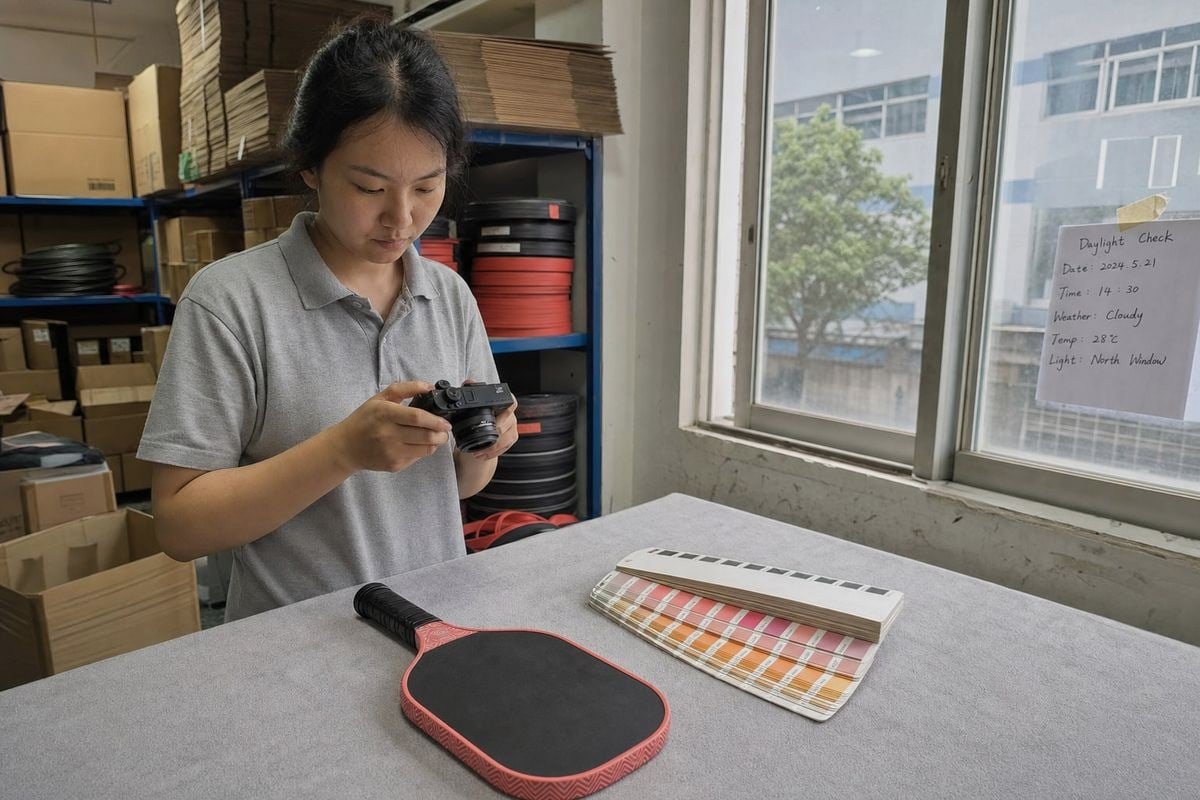
Some screen-first sellers will tell you a digital mockup is enough, especially for simple text or logo designs. I understand the appeal, because it is faster and cheaper. But here is the honest resolution to that objection: mockups are necessary for design approval, while physical samples are the final authority on color and pattern. A mockup cannot show you how ink sits on grit texture, how a matte coating shifts your brand red, or how thermoforming heat affects certain pigments. On thermoformed paddles, high molding temperatures can push light blues and pinks toward yellow or darker tones, and no PDF proof will ever reveal that.
Digital mockup vs physical sample
| Check | Digital mockup | Physical sample |
|---|---|---|
| Layout, spelling, logo position | Yes | Yes |
| True printed color | No | Yes |
| Ink interaction with face material | No | Yes |
| Texture and grit light-scattering | No | Yes |
| Edge guard coverage of artwork | Approximate | Exact |
| Finish quality and durability | No | Yes |
How the sample stage works in practice
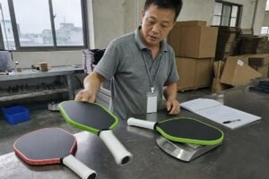
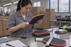
After you confirm the digital proof, we produce one paddle using the real materials from your order, including the same core, face layer, and UV printing process. In our 16mm Gen5 PP honeycomb 7 builds made with one-piece hot pressing, the sample takes about a week. If you cannot inspect the sample in person, ask for daylight photos and video from multiple angles. We also run basic ink durability testing on samples, scuffing the surface to check adhesion, because a beautiful print that chips in the first month damages your brand more than a delayed launch. Approve only when the sample matches the agreed spec sheet, then keep records of that approved version. It becomes your contractual reference for the whole production run.
How do I avoid color and pattern mismatches when working with an overseas manufacturer?
Most of my buyers in the US, Canada, and Southeast Asia never visit our Qiaotou facility. Distance does not have to mean risk, but it does demand a documented process instead of casual chat approvals.
Avoid mismatches with an overseas manufacturer by documenting every color and layout decision in writing, using Pantone references, approving a digital proof and then a physical sample, requesting daylight photos and video, and authorizing production only after the sample matches your recorded spec sheet.
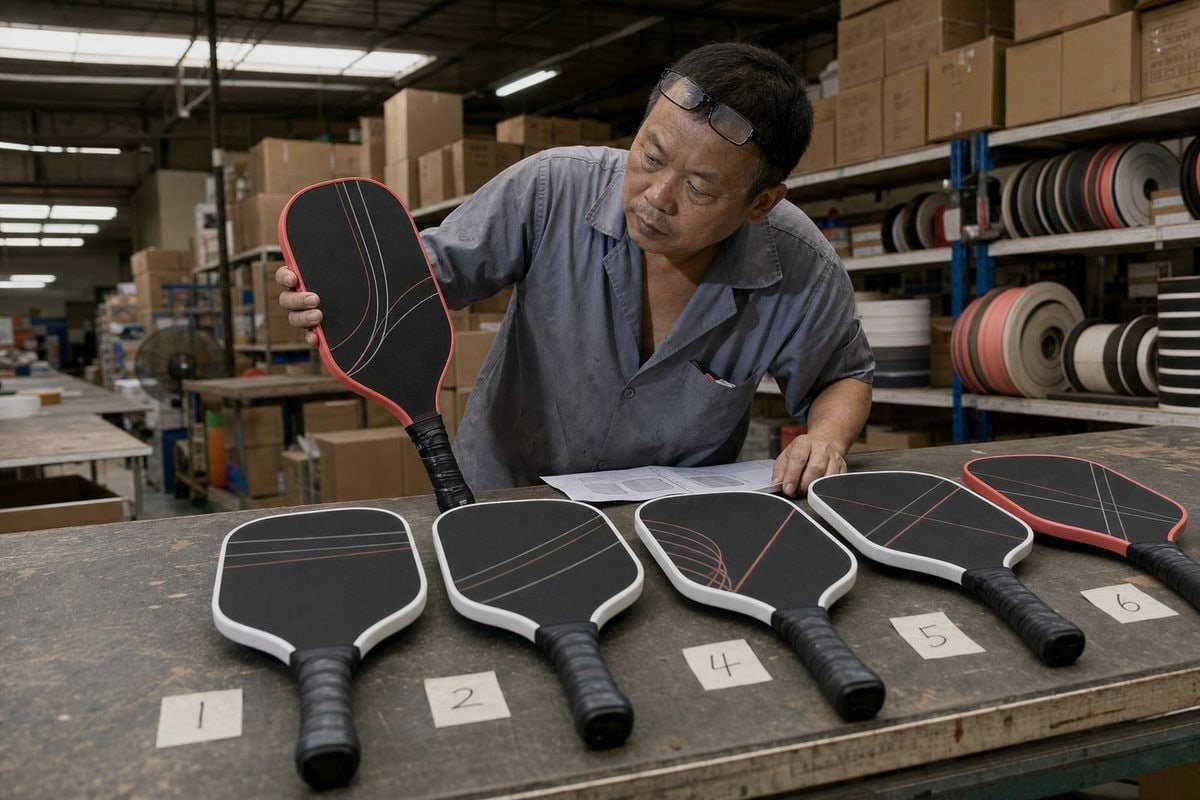
Working across borders removes your ability to walk into the print room, so documentation replaces presence. In my experience exporting to eight countries, the orders that go smoothly all share one habit: nothing is approved verbally. WhatsApp voice notes disappear into history; a written spec sheet does not.
A five-step overseas approval workflow
- Define the spec. List PMS codes, pattern files, logo positions, finish type, and paddle model in one document.
- Review the finalized design file. The supplier organizes the artwork on the paddle template and sends it to you before printing anything.
- Approve the digital proof. Check placement, spelling, bleed, and orientation. Use your revision rounds.
- Inspect the physical sample. Compare it directly against the design. Small, acceptable differences mean the paddle matches your design.
- Sign off in writing. Confirm the sample photos, archive them, and only then release mass production.
Handle lighting and photo honesty
Color metamerism is real: two colors can match under one light and drift apart under another. Ask your factory to photograph the sample under both indoor LED light around 5000K and direct sunlight, since your customers will play in both. Also request photos of dark patterns up close, because surface grit can scatter light and make deep blacks look slightly ashy. A trustworthy supplier will show you this honestly rather than only sending flattering studio shots. Finally, keep the approved sample itself. If a dispute ever arises over a later batch, that physical reference settles it faster than any email thread.
Conclusion
Confirming color and pattern for custom pickleball paddles is simple when structured: review the design file, print one sample, compare them side by side, and approve production only after they match.
Footnotes
1. Technical explanation of the physical substances used to provide color in printing processes. ↩︎
2. Explains the process of using ultraviolet light to dry or cure ink during printing. ↩︎
3. Authoritative government source on the properties and manufacturing applications of carbon fiber materials. ↩︎
4. Authoritative Wikipedia entry explaining the Pantone Matching System and its standardized codes. ↩︎
5. Academic overview of how matte coatings affect light reflection and color perception on surfaces. ↩︎
6. Defines the file format necessary for high-quality, scalable graphic design in manufacturing. ↩︎
7. Authoritative overview of honeycomb structures used in composite material cores like polypropylene. ↩︎